Hello,
and welcome to my portfolio. While creating this website,
my main concerns were immediacy and user-friendliness, and I hope you will find both of those attributes fullfilled.
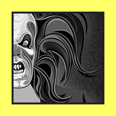
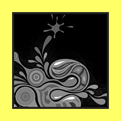
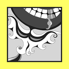
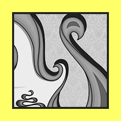
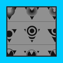
Interaction
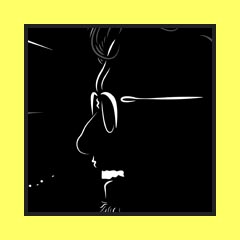
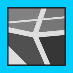
of flat colors has always fascinated me. These illustrations are studies of such interactions built upon patterns and shapes, and their repetition - concepts, which I later studied within the graphic design discipline.
A selection
of my work within the discipline of Graphic Design, more speificially identity design, materials for print, interactive web-based projects, sprinkled with some motion design.
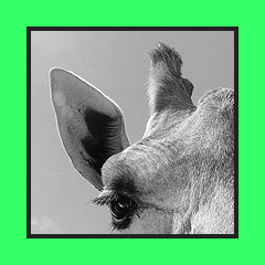
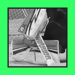
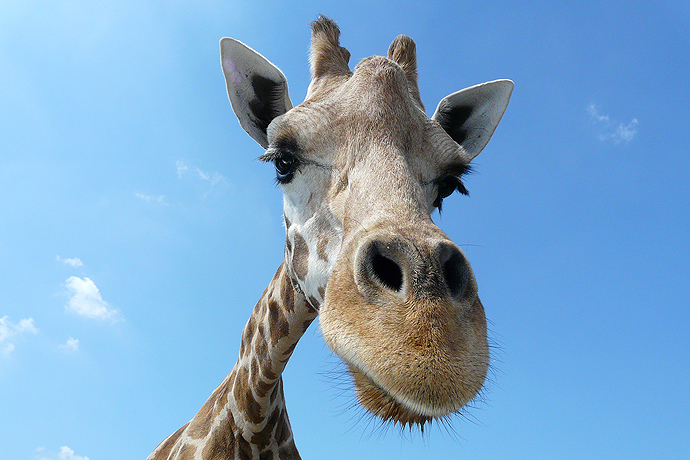
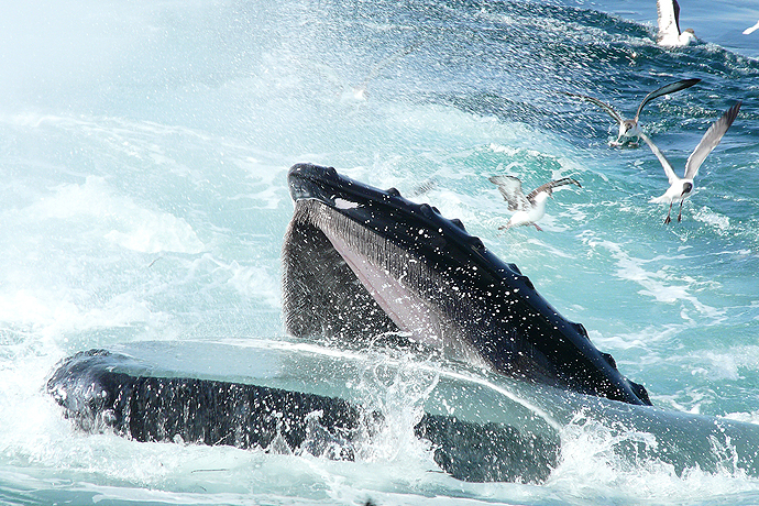
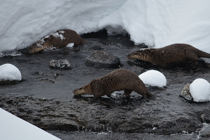
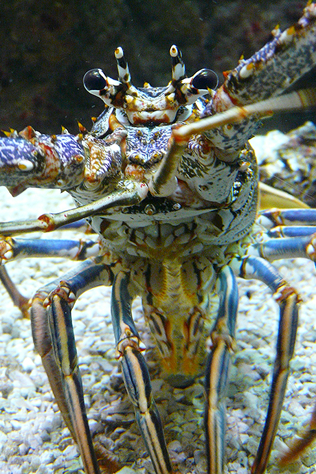
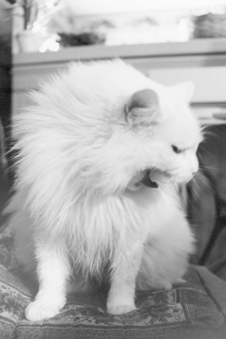
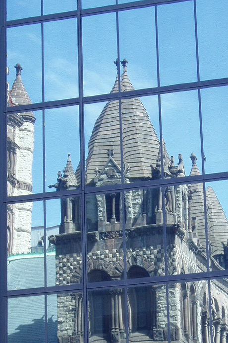
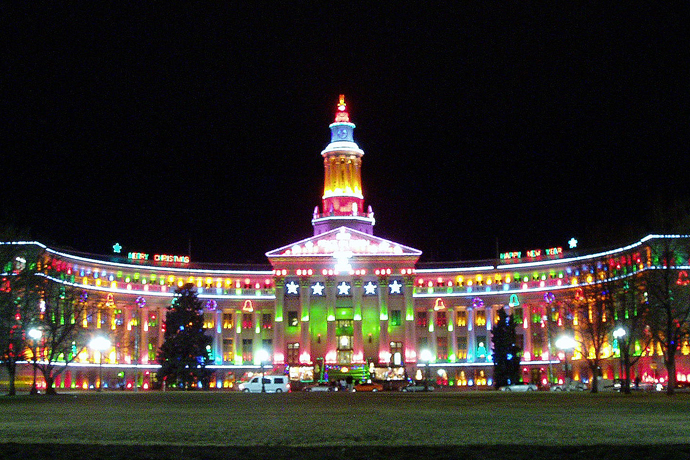
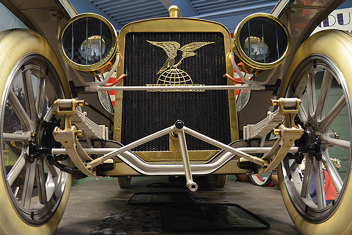
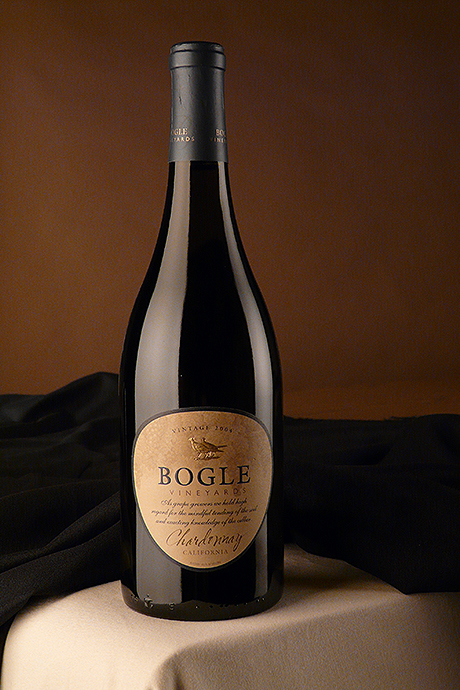
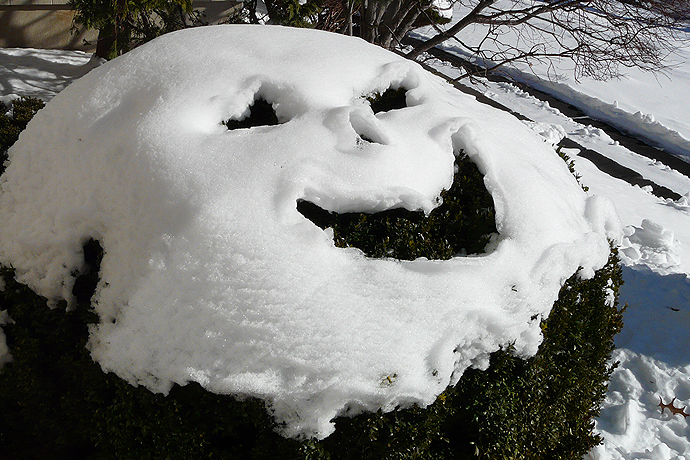
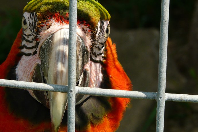
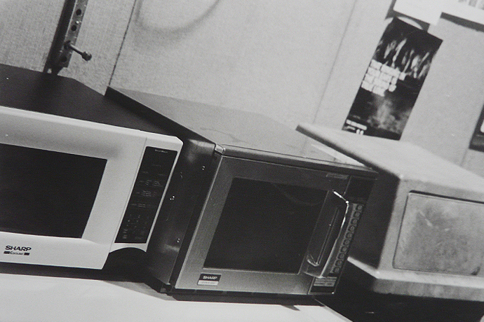
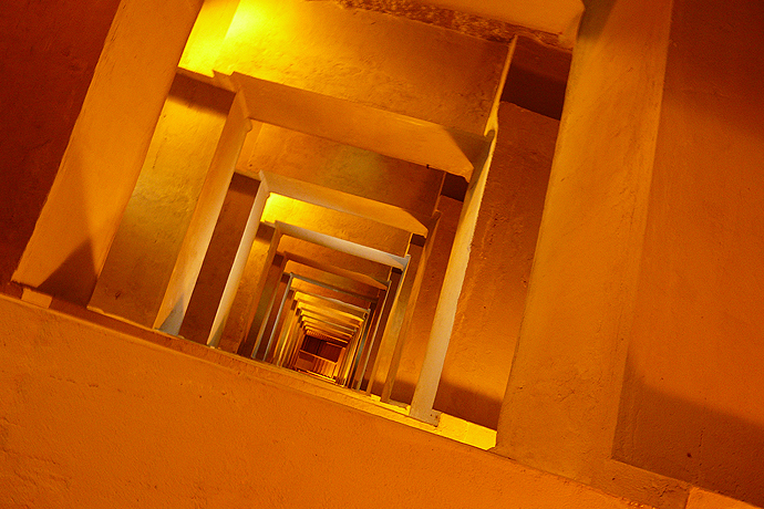
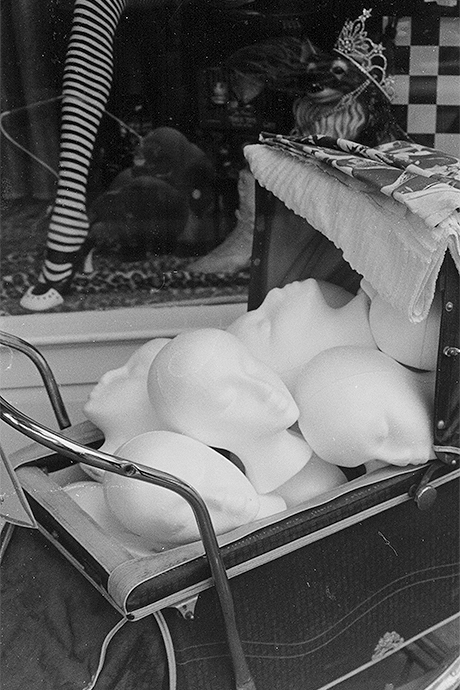
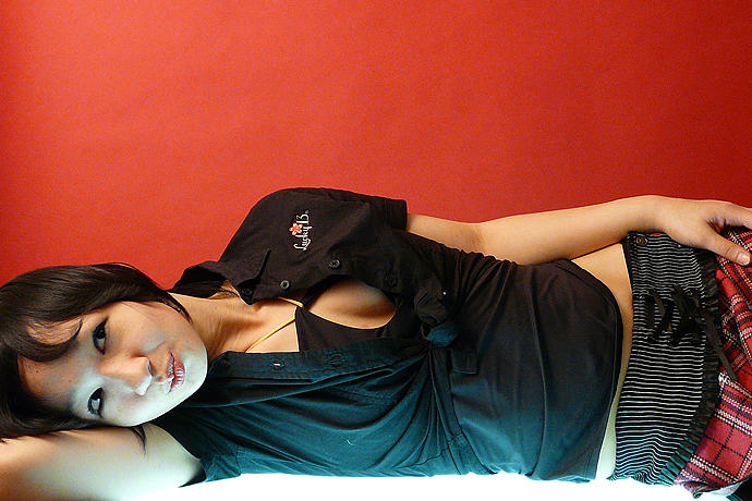
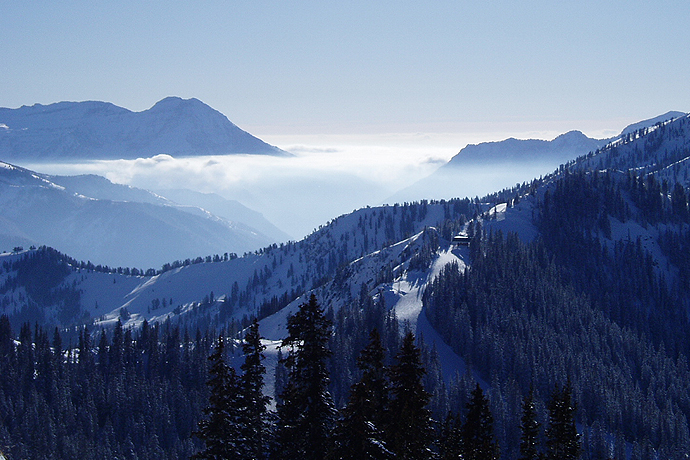
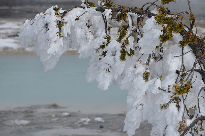
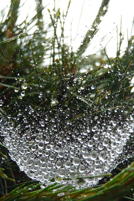
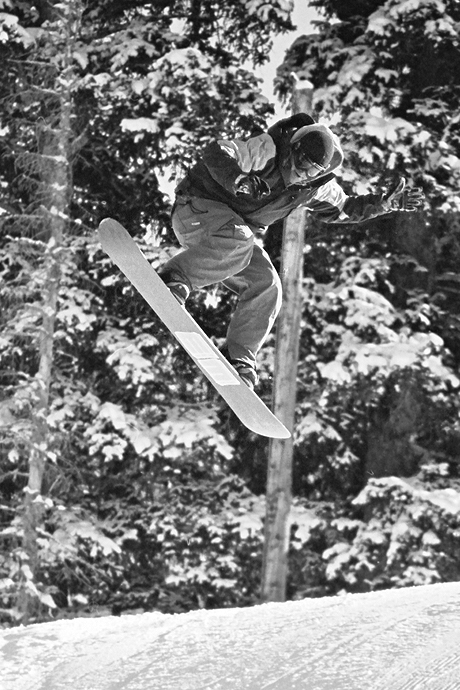
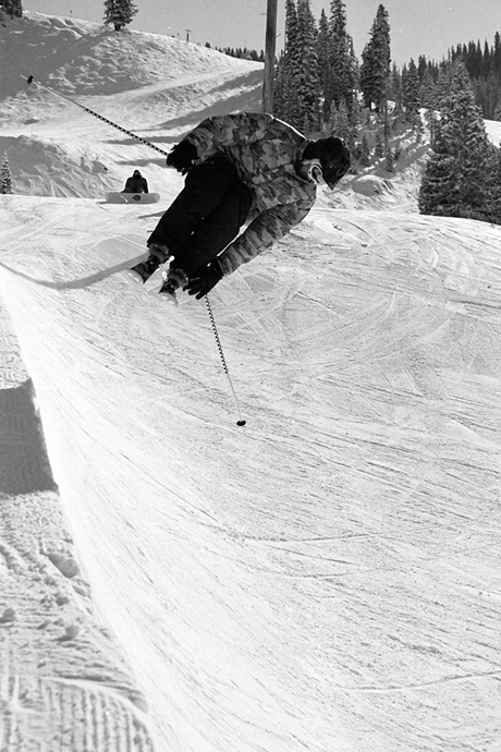
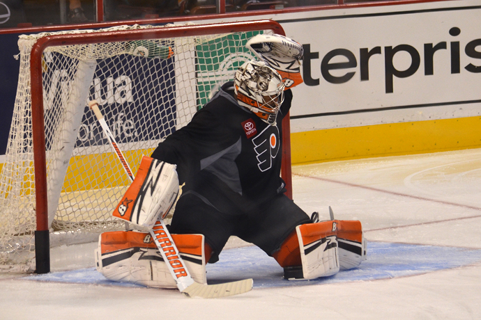
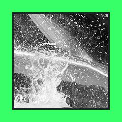
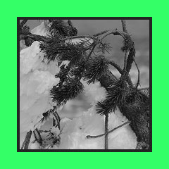
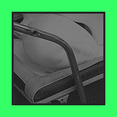
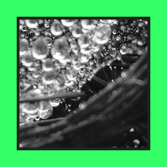
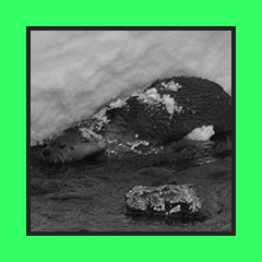
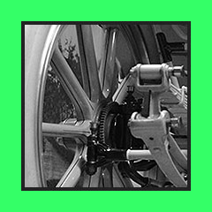
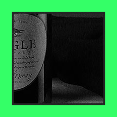
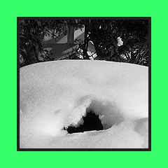
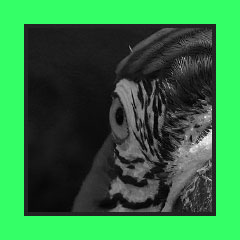
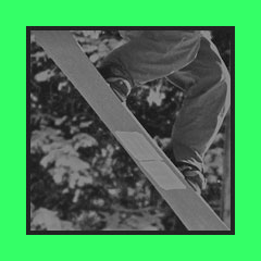
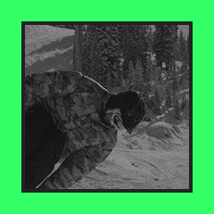
Capturing
the perfect moment is my favorite challenge with
the camera. Here, you will
find a range of studies:
from nature to man-made; whether conceptual
by design or on the go;
some were taken digitally,
while others on film.
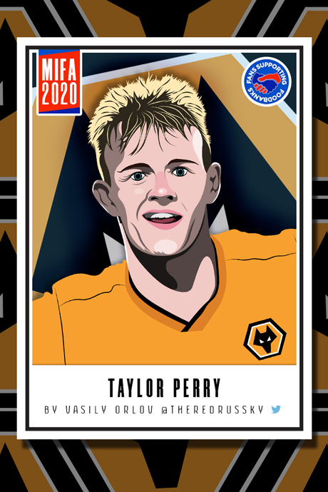
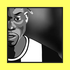
MIFA-2020 project
was a collective effort from online artists to help raise money for foodbanks that had lost their ability to gather supplies due to COVID-19.
Here is my illustration of Wolverhampton's Taylor Perry.
Read more about the project
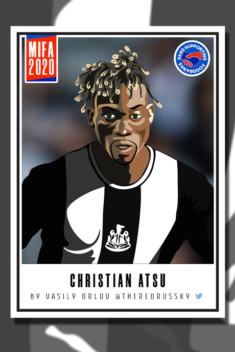
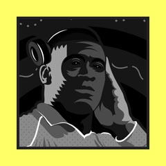
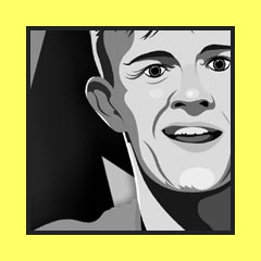
hereMIFA-2020 project
was a collective effort from online artists to help raise money for foodbanks that had lost their ability to gather supplies due to COVID-19.
Here is my illustration of Newcatsle's Christian Atsu.
Read more about the project
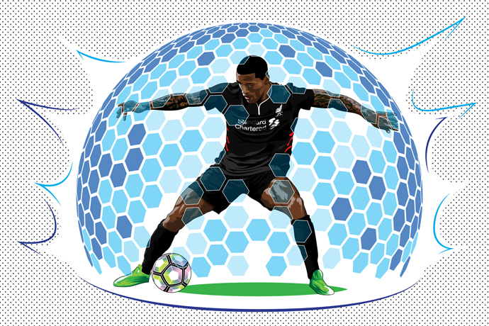
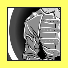
hereWijnaldum Forcefield
is a visual representation
of Liverpool's ex-player
Giorginio Wijnaldum's
best on-field attribute -
ball protection and retention.
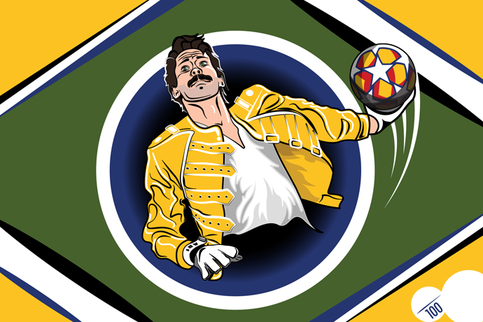
Alisson Mercury
is an illustration I did to commemorate a brief moment of time when Liverpool's goalie sported a mustache very reminiscent of Freddy Mercury's, while also wearing a yellow jersey akin in hue to the famous
leather jacket.
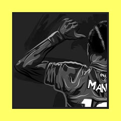
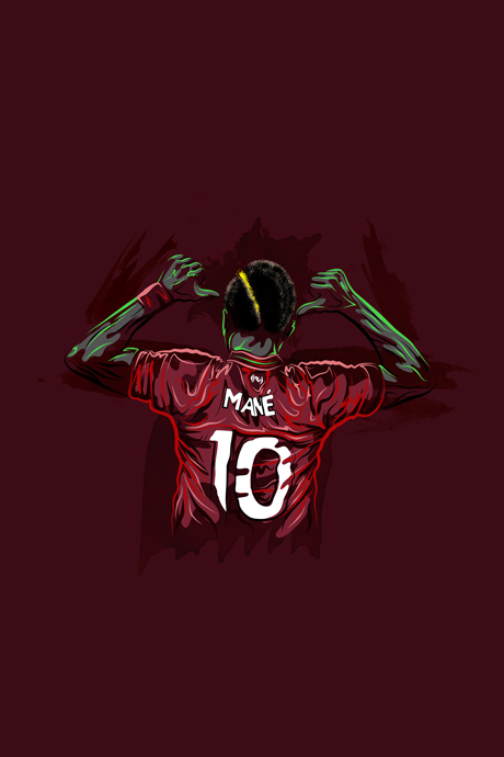
Sadio Manè
is a Senegalese footballer who used to play for Liverpool.
Here, I tried to give this illustration a national vibe
via use of colors that
make up Senegal's flag.
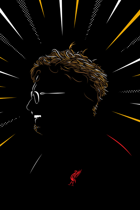
Jurgen Klopp
is Liverpool's manager.
Attempt at an illustration that looks like a woodcut print.
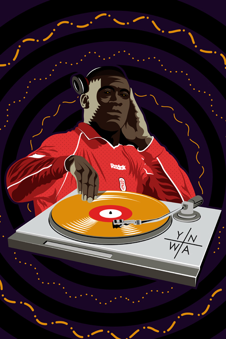
DJ Heskey
is a design in honor of Liverpool's ex-player Emile Heskey and his then famous hand-on-one-ear, DJ celebration.
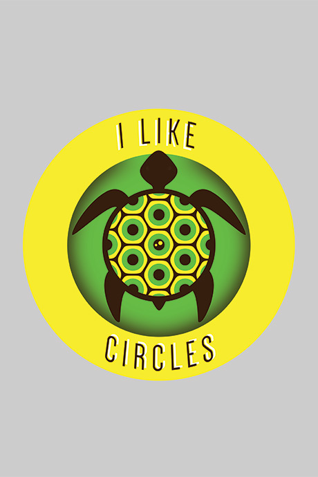
I Like Circles
is a t-shirt design, with my take on the so very famous "I like turtles" viral video.
Revolution,
created for EvokeOne's art
pack, also called "Revolution".
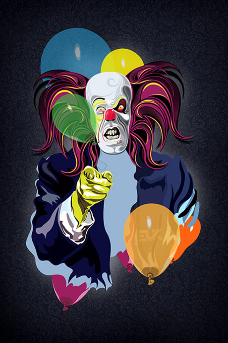
Pennywise and Uncle Sam
come together.
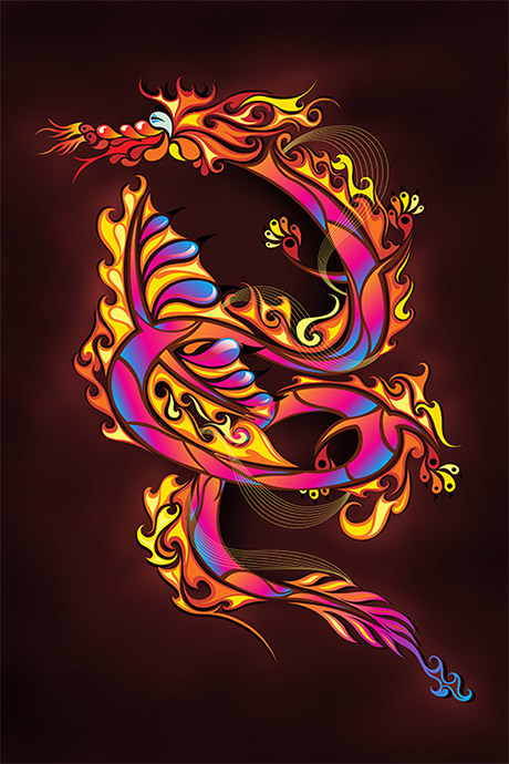
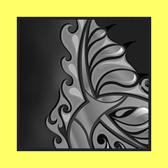
Fiery Serpent,
Chinese motifs are present.
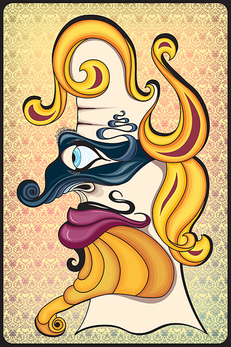
Jack
will one day be a part of illustration series with my take on the king-queen-jack trio.
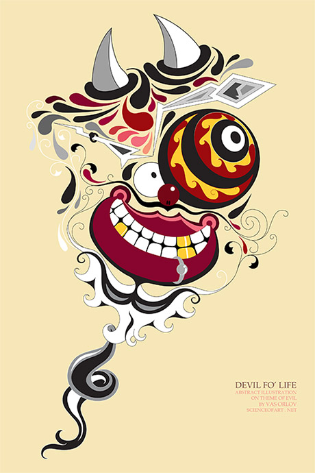
Devil Fo' Life,
what a bad boy.
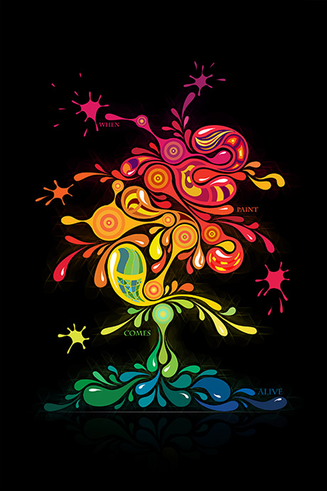
Paint Alive,
a consideration of what
form a paint tree would
present itself in.
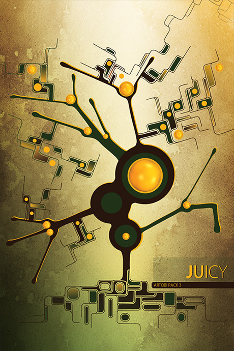
Juicy,
created for Artobi's art pack.
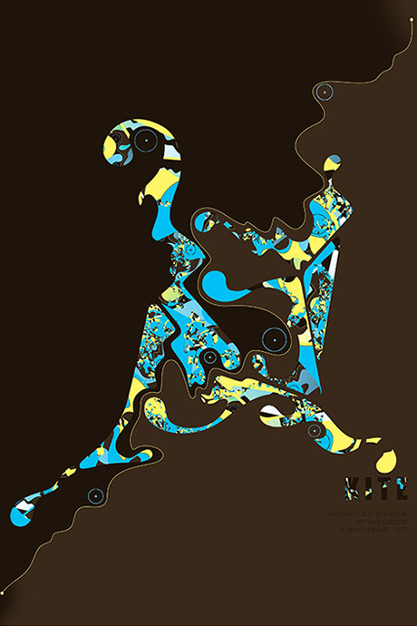
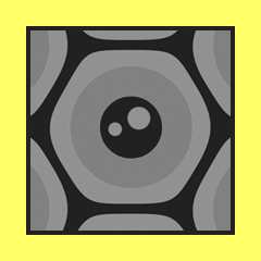
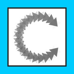
Kite
was pure experimentation
with shapes and repetition.
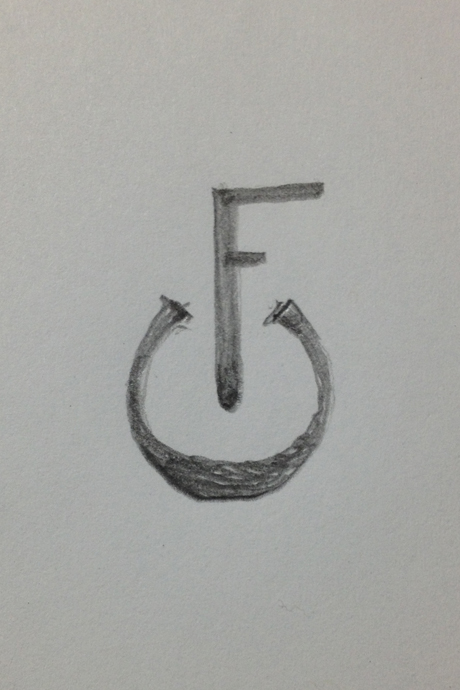
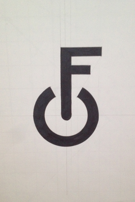
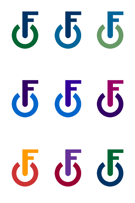
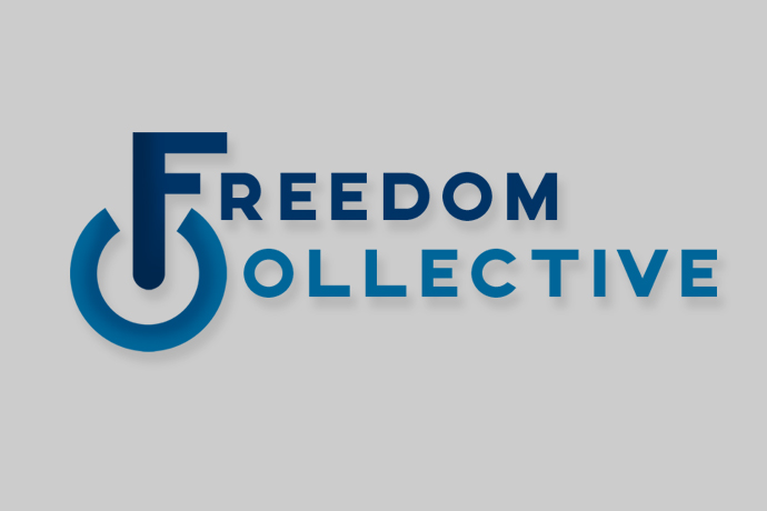
Freedom Collective
is a Massachusetts based non-profit advocacy group aimed at lowering the legal penalties for non-violent offences. The final brand takes on shapes of both the power symbol, and a key.
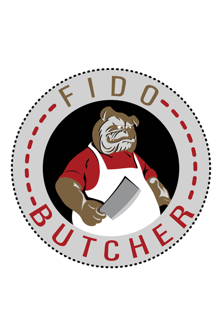
Fido Butchery
is a Brooklyn based butcher shop specifically aimed at bringing healthy cuts for dogs. By dog owners for dog owners.
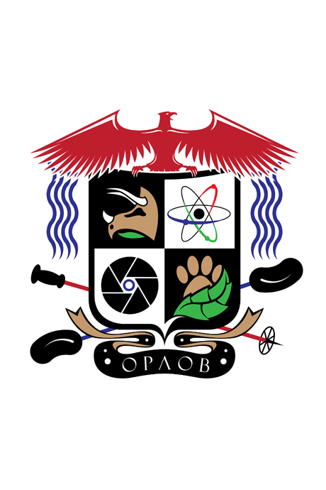
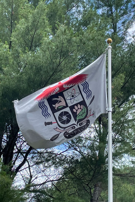
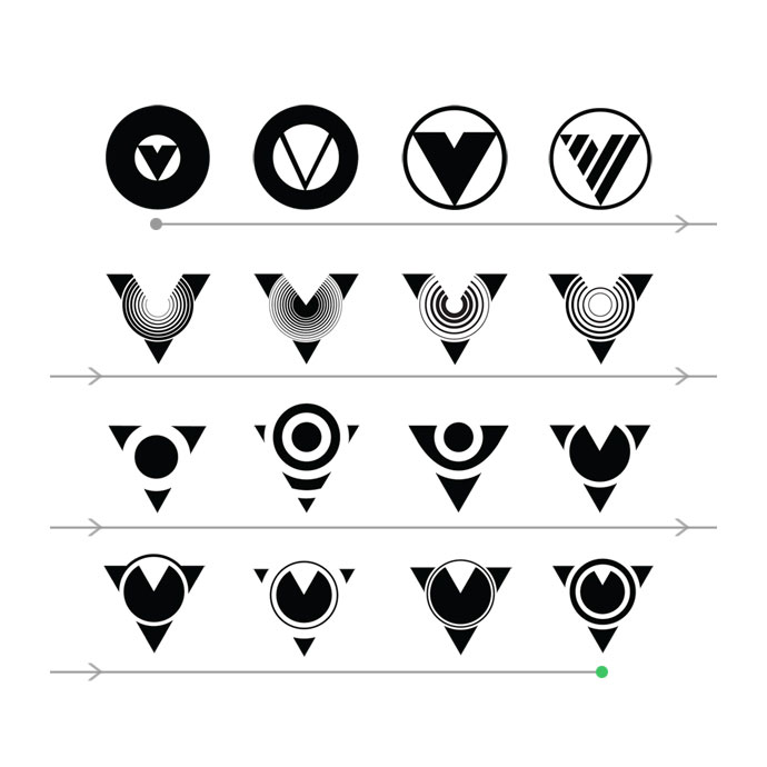
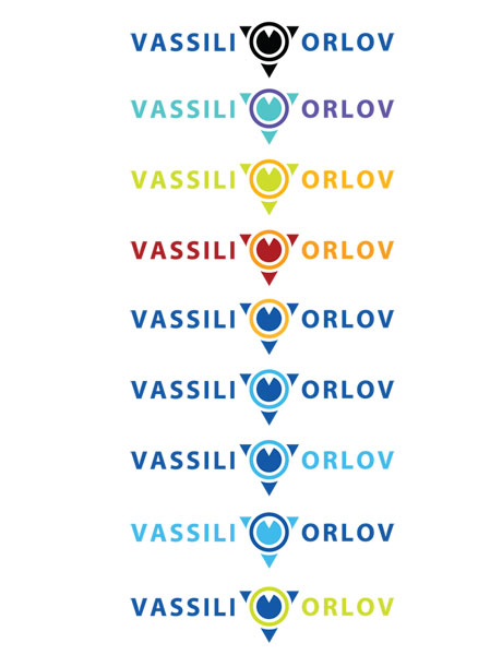
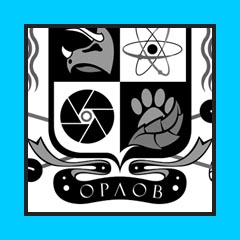
Orlov Family coat of arms
is a modern take on heraldry. Here, I've combined several symbols of importance to my family to create the coat of arms. It has been produced into a flag, and is proudly displayed on my family's property.
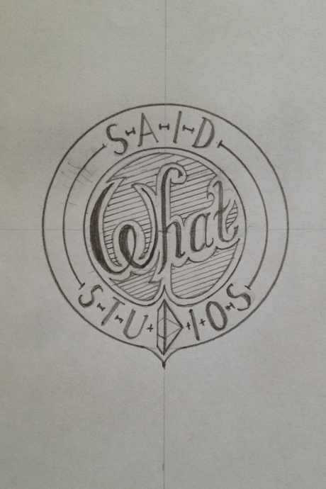
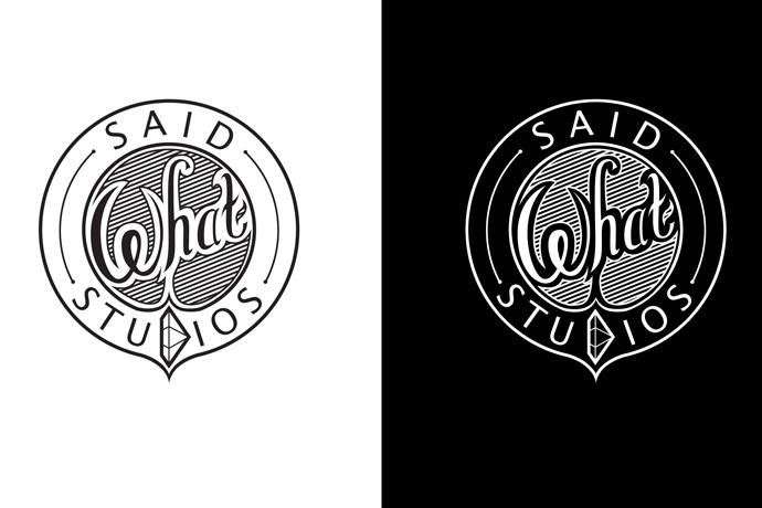
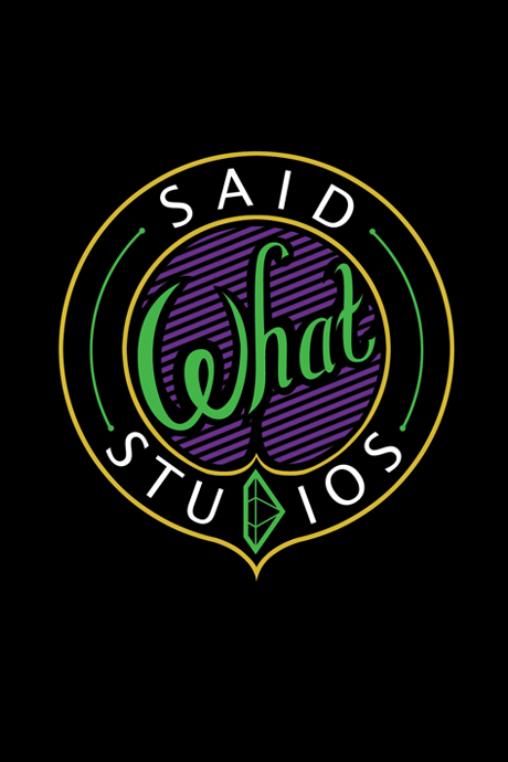
Said What Studios
is a fine jewelry company that was in need of branding.
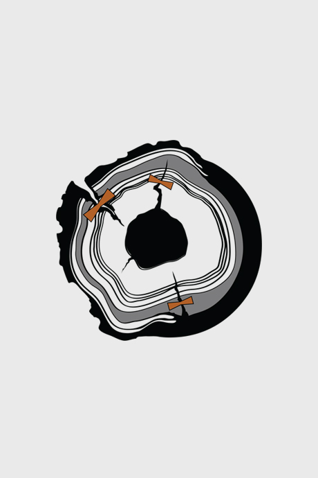
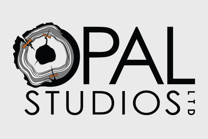
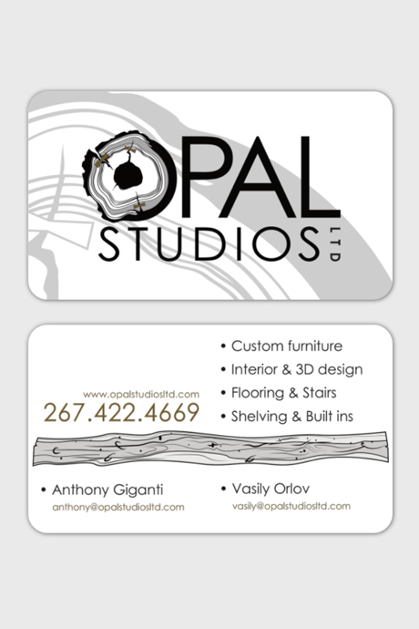
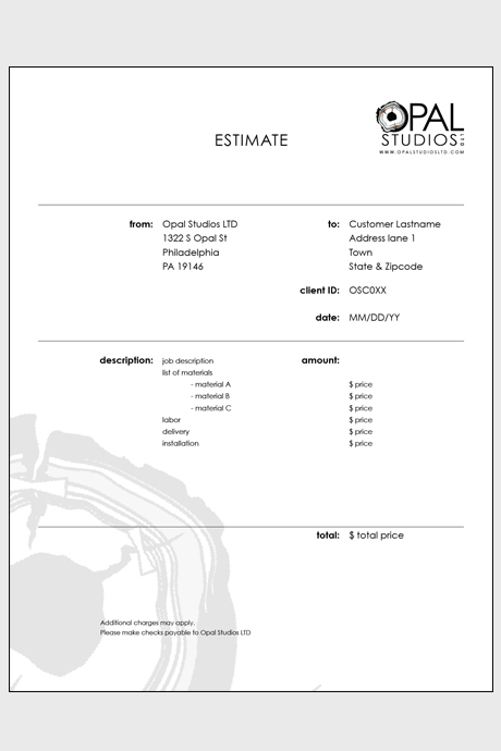
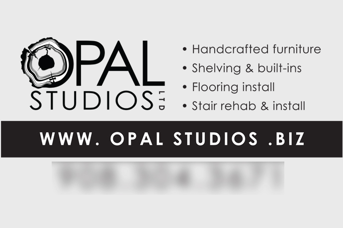
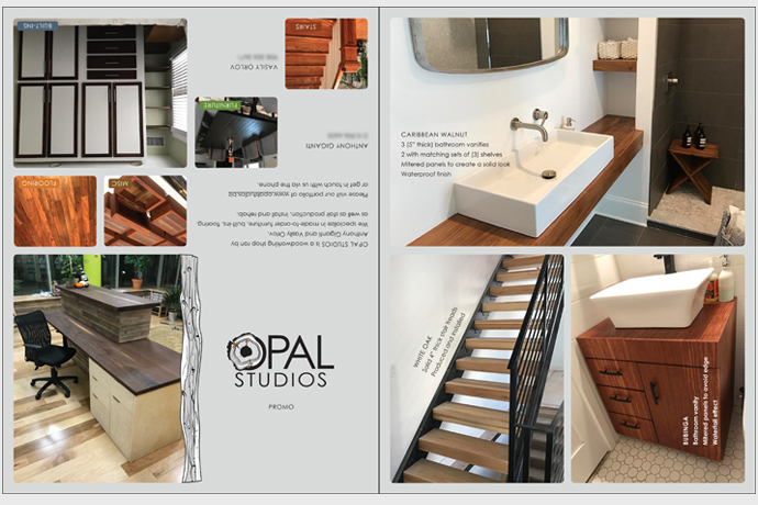
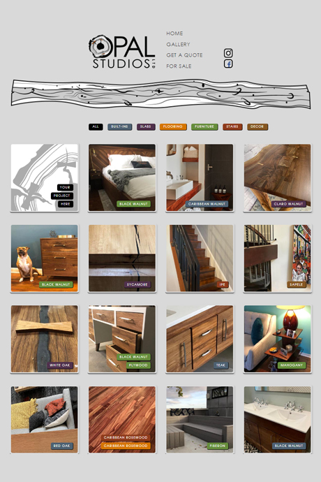
Opal Studios
is my current venture - a woodworking company where I hold a multitute of creative and official responsibilities.
Here you will find examples of identity, stationery, promotional, and web design.
Aside from that, I'm also responsible for product design, manufacture and photography; bookkeeping, official paperwork and customer relations; operating heavy machinery,
as well as welding.
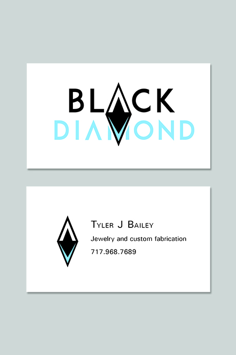
Black Diamond Jewelry
is an ongoing project with Tyler Bailey, a great friend of mine, who has launched his own business and has charged me with identity development. Being based in Colorado, it made sense to play off of the connection between diamonds in the skiing industry, and those of interest to the jewelers.
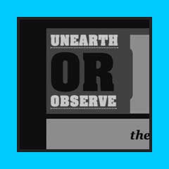
Communicating without words
is the name of my Senior Thesis interactive web page. In it,
I take a look into the history of
visual communication.
NOTICE: Upon landing on this page, a Flash® intro would begin playing. Since the required player is no longer available, the landing intro is disabled. Please enjoy the rest of the project.
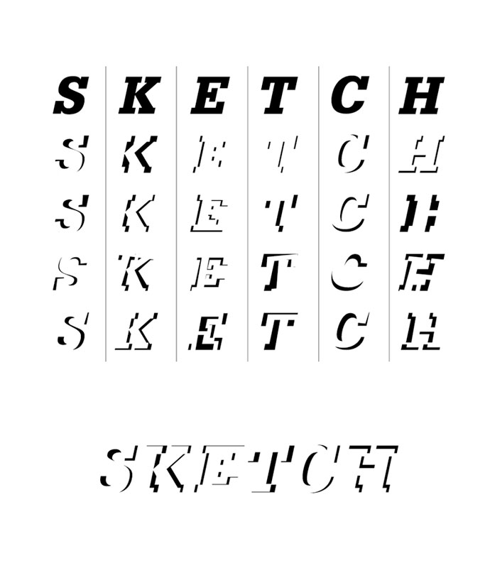
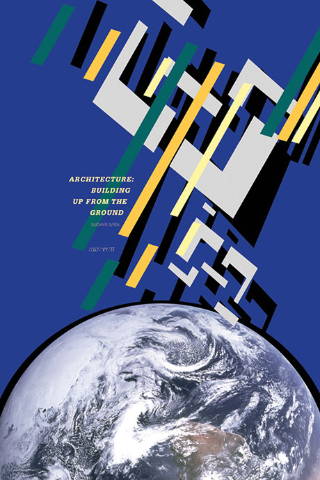
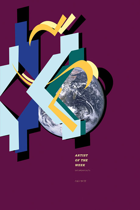
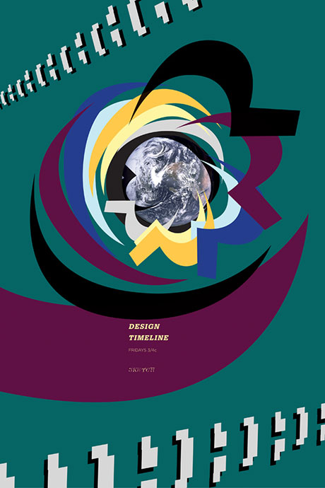
Sketch
is a design-oriented informative TV network. I developed the identity, created printed advertising via a series of posters in correspondence with the chosen color scheme, as well as the two video productions.
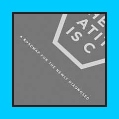
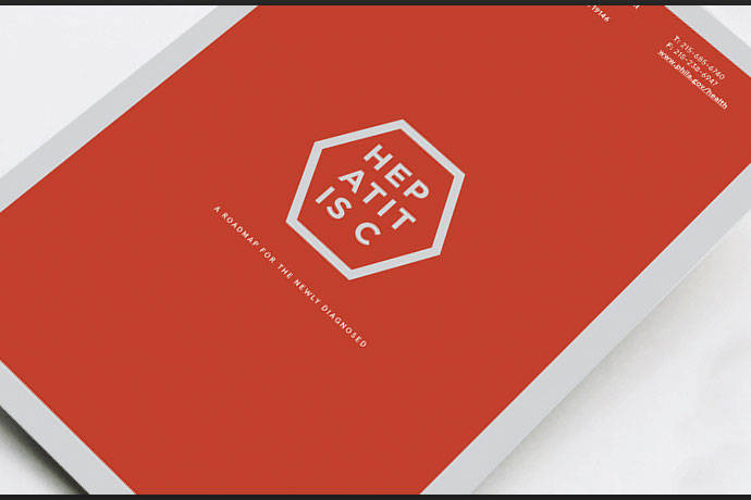
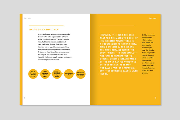
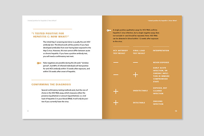
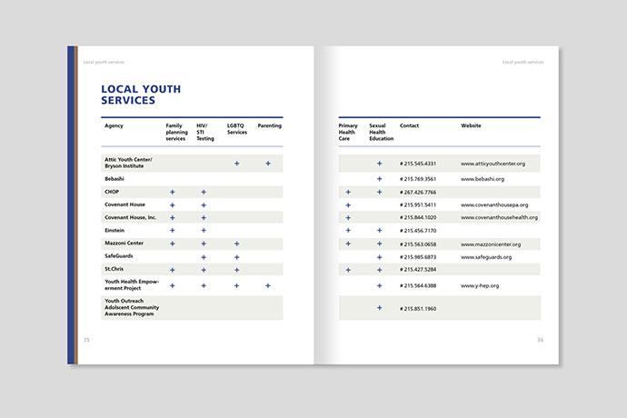
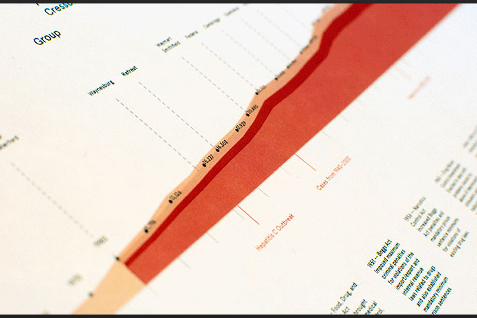
Hepatitis C
awareness brochure,
done for the Philadelphia
Health Department.
Credit: Zircon Studio.
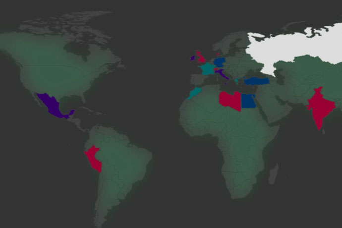
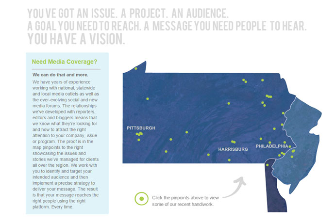
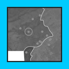
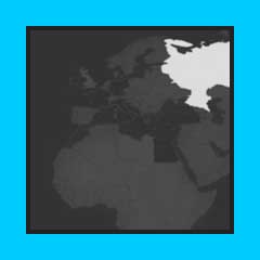
Interactive
pindrop map created for the Ceisler Media and Issue Advocacy to showcase the work of the company. Collaboration with Angela Iannarelli.
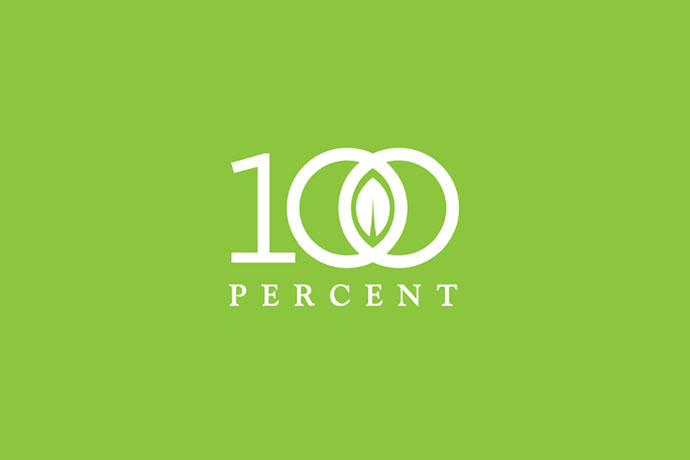
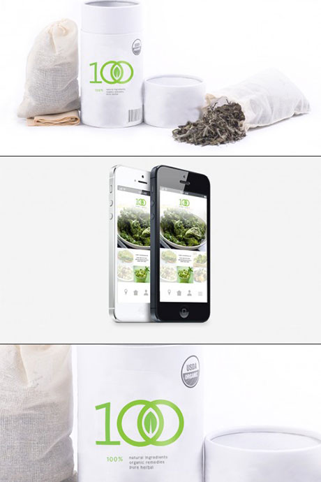
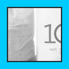
100 Percent
logo design. A supplier of medicine-oriented, plant-based products, 100 Percent required an identity which supported the company's aim to "go green". Credit: Zircon Studio.
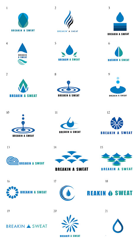
Breakin'
A Sweat
branding project for a
local Philadelphia gym.
Credit: Zircon Studio.
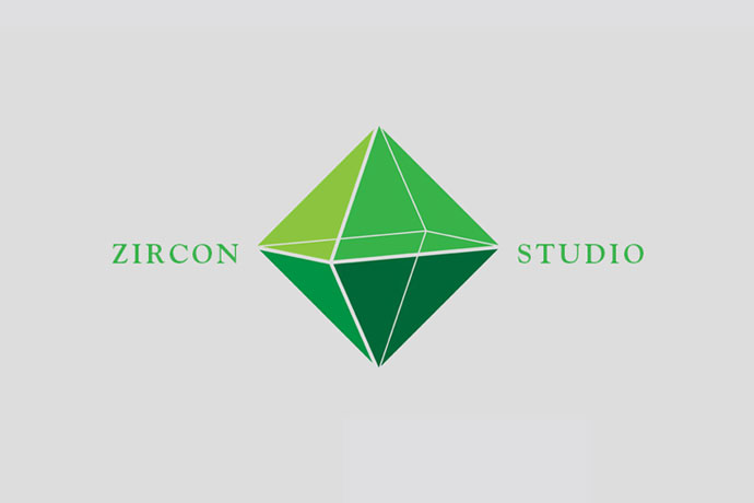
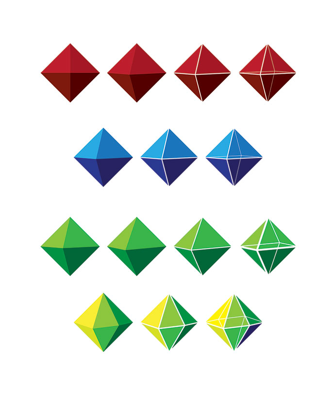
Zircon Studio
was a design company started by Demian Yoon, Donald Swain, and myself.
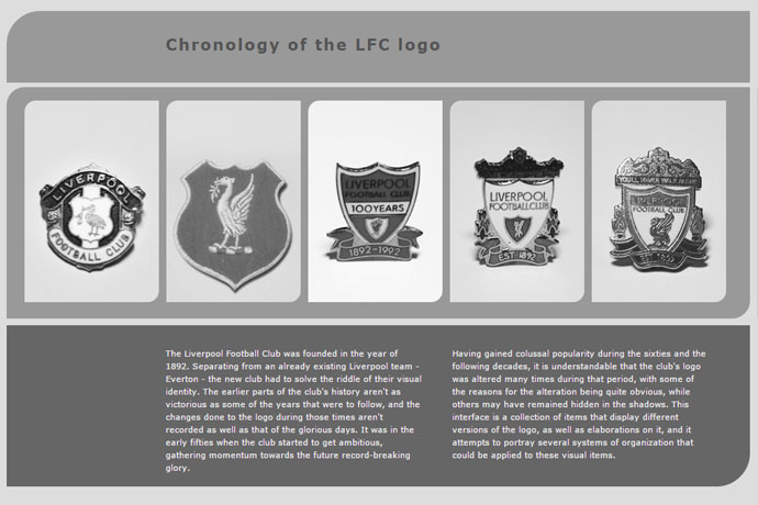
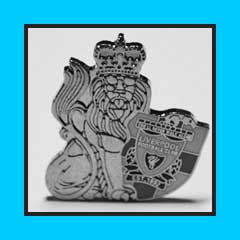
Liverpool FC
is the focal point of this interactive application, which explores the club's logo and it's progression over time; items connected with the club; and shows several applicable organizational systems.
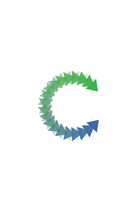
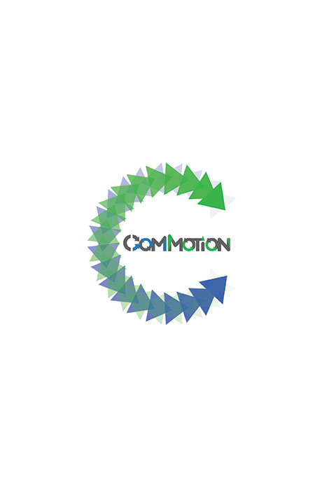
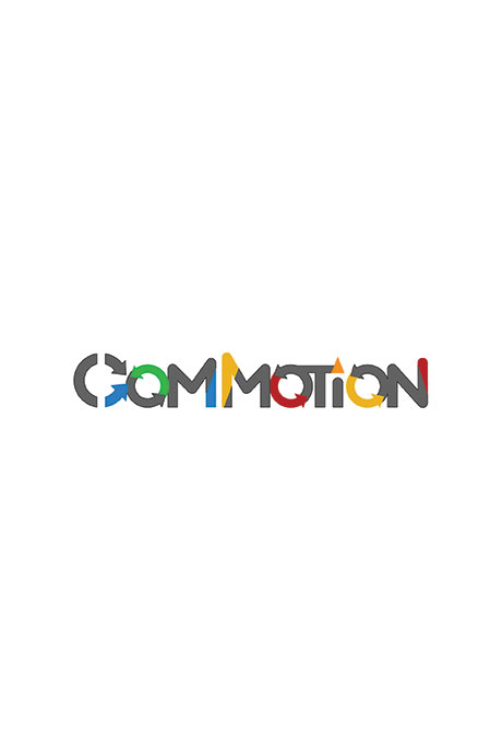
Commotion
was an initiative by the Peco Energy company and UArts, aimed at bringing art to the communities of Philadelphia.
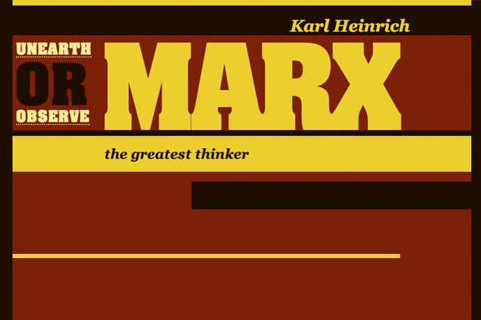
Karl Marx
was an immensely important figure for the development
of the European society -
that's why I chose him for this CSS project, in which I was tasked with creating an online page that portrays the individual of choice - contextually, visually, and typographically.
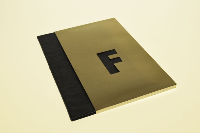
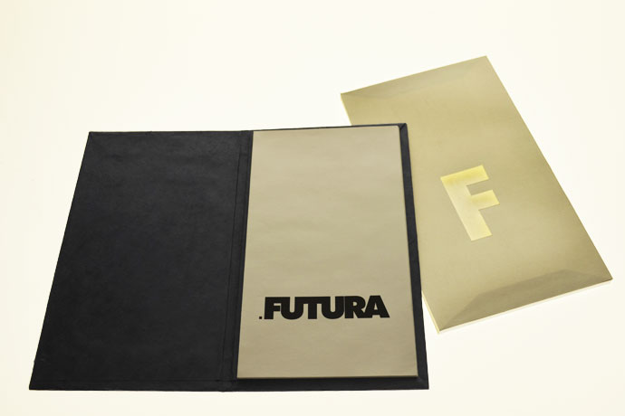
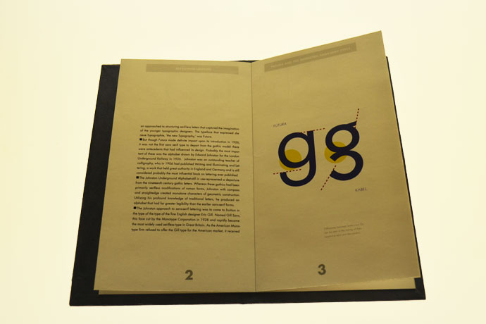
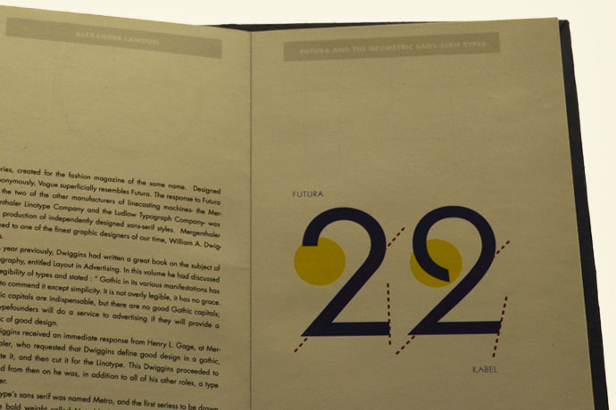
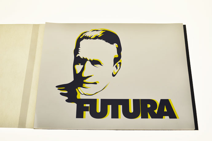
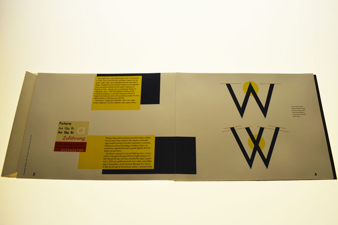
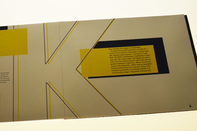
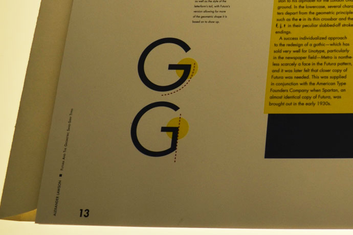
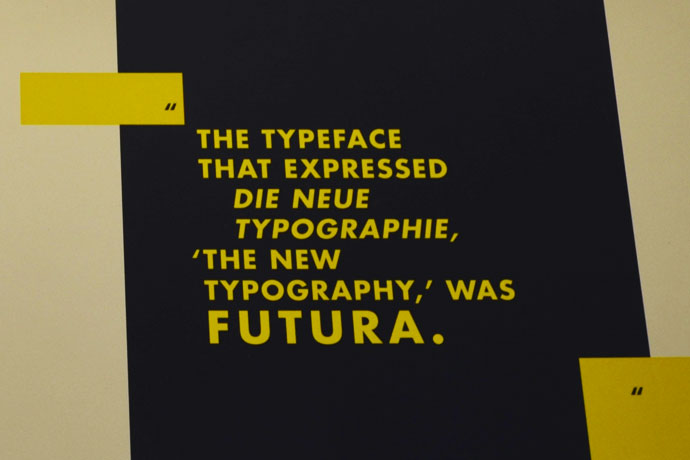
Futura
has always been one of my favorite typefaces. In this small book and editorial series I compare Futura with a similar geometrical typeface Kabel.
Identity
design was the focus of a workshop with the reknowned graphic designer Jerry Kyuper.
Typography
series based on a chosen theme. Set in a fixed size square, these studies began with one font setting, with more choices made available through the process. 1st - Univers 45
2nd - Univers 45/65
3rd - Univers 45/65/55
4th - Bodoni
5th - Large size Univers
6th - Extreme size
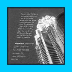
7th - First event image
8th - Second event image
Postmarks
combine many descriptive interpretations of the chosen items, finished in digital form.
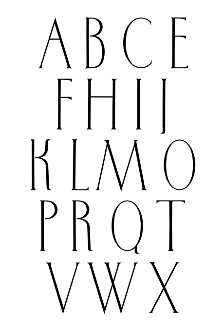
Letterform
study. I was interested in creating a typeface
with a tall x-height.